UX/UI design improvement plan for an e-commerce platform.
Project Type
User Experience Analysis, User-centered Design, UX/UI & Usability Design Improvements
Keywords
Usability Heuristics, User Research, User Experience Design, User Interface Design, E-commerce.
My Roles:
UX/UI Designer, Product Designer
Overview
UX/UI Design improvement plan developed for Spocket, a dropshipping e-commerce platform that integrates with relevant e-commerce platforms (Shopify, BigCommerce, Wix, and WooCommerce). This project took place in January 2021, as part of their design challenge.

Problem Statements
Spocket's project brief reported the platform's following problems:
-
Customers are having difficulties using the search filters and narrowing down products on the Search Page. An easier and faster way is needed for retailers to narrow down product searches on the Search Page.
-
It is also hard for customers to narrow down and organize orders they have on the Order's Page. Additionally, there is no clear way for them to track their orders.
-
Users are having trouble contacting Spocket if they have any order issues.
My Task:
-
To conduct a user experience analysis and to provide a design solution plan to the reported problems.
-
Preserve the platform's existent visual guidelines.
Design Pillars
When creating a plan of design, I always consider 3 essential elements that determine the value of a product:
A. Human Desirability (Design)
Usability heuristics, user-centered best practices, metrics acquired via user & customer research (users' goals, pain points, and emotions/behaviors), and customer empathizing.
B. Technical Feasibility (Engineering)
Restraints and characteristics of how the system is built, so the design choices are thought to better fit the existent technical requirements.
C. Economic Viability (Business)
Metrics based on business goals.
Customer Journey Map
To better visualize a broad overview of the product and its existing user experience workflow, I created a Customer Journey Map.

User Empathising
To better understand customers' behaviors, motivations, and preferences - I conducted an initial customer research investigation:
-
Quantitative User Research: understand and quantify what actions users are doing.
-
Qualitative User Research: understand the user's 'Why's and motivations behind what they're doing.
As a part of this process, I interviewed 7 e-commerce owners that could highly qualify as Spocket's target audience. Examples of interviewed users:

E. Imai, Age 34, Female

E. Imai, Age 34, Female
User Interviews
My investigation was focused on activities performed when searching for products to sell and working with orders, the main problems from the Spocket platform.
Primary Goals:
Discover goals, pain points, and motivations of the target audience, when:
-
Searching and finding products to sell at their store
-
Organizing and filtering orders
-
Tracking orders
Desired Outcomes: Discover Design Insights and Takeaways, that would facilitate and optimize the activities performed by customers.
Design Insights and Takeaways
Search Filter
Most times, users never use Search filter options to find products. They prefer to type and search for keywords directed to their products, as it takes a lot of time to keep narrowing down from a bigger category to smaller ones (e.g. Clothing > Women's Clothing > Dresses). It should be easier to select children categories (out of parent categories) from the filter.
Most users prefer to look for product specifications: clothes' sizes (XS, S, M, L, XL), colors, object's dimensions, and weight (and not only the product itself).
Product Orders
The Order Date is the main important information (see the most recent ones, which would need Checkout action).
It is also very useful to filter orders by tags, countries (origin & destination) and suppliers.
When working with orders, most users mentioned it's helpful to see an overview of the entire process (the orders categorized as "Checkout", "Processing", "Shipped", "Completed").
When tracking orders, most users stated that the order's location is almost irrelevant, while the estimated date/time of arrival is the most important info their customers want to know.
With these insights at hand, now we can jump into the design solutions.
Design Solution: Search Page
Problem Statement: it is difficult to search and narrow down products on the Search Page.
Primary Goal: design a way to make the process more intuitive and natural.
Desired Outcomes: improve the user work-flow, so users could narrow and search products in an easier and faster way.
Down below is an image of the existing Search Page, where users can research suppliers, and search & discover products to be sold at their personal e-commerce stores.

Existing Search Products Page
Analysis & Problems
1. The filter workflow is partitioned in 4 different areas, which may confuse users who may not easily understand where to focus when narrowing down products.

The different areas users can interact with the filter
2. When clicking above any of the Parent Categories (e.g. Women's Clothing), they are then expanded in a carrousel, with the Children Categories right below.


The same Parent Categories have 2 different visuals depending on the stage of the flow the user is.
3. The main components of the filter (Filter Options and Selected Filters) are arranged in a way that could confuse users.

The same Parent Categories have 2 different visuals depending on the stage of the flow the user is.
In summary, the main problems are:
-
The filter interaction workflow is not linear.
-
Selected filters are intercalated with the filter options, having no hierarchy.
-
It is not possible to choose multiple children categories out of a parent category. (For example, select both "Dresses" and "Jackets & Coats" out of "Women's Clothing".)
Workflow Organization / Wireframe
1. To organize the navigation workflow, I divided the Search filter in patterns:

The filter can be divided in patterns or purposes.
2. Each search pattern can be reorganized, so users could better understand the steps they need to take to configure a product search, as shown below:

Wireframe of the improved filter design
3. Now we can proceed to how the Selected Filters will be displayed. The main objective here is to mitigate the existing usability problems by:
-
Allowing users to select multiple children categories from a parent category (for example, select both "Dresses" and "Jackets & Coats" out of "Women's Clothing").
-
Organizing the Selected Filters at the top, under the Title "Filters". (the main reason for this choice, is to make the selected filters visible and easy to find - as the existing Filter Feature has a lot of visual elements (which, at the moment, couldn't be changed)

Linear reading
4. Going further, users could select multiple Children Categories, and delete each one of them individually, adding more control in the process of customizing their search:

Selected Children Categories are grouped inside their Parent Category, and can be deleted individually.
Proposed Design Solution
Translating the wireframes to a layout, we arrive at the solution below.
1. The Shipping options can be selected through checkboxes.
2. All Selected filter settings will be displayed under the Title "Filters".
3. The existing button "Filters" was kept the same, but re-named to "Advanced".
(as all these elements are filters)
4. The Sorting options (Relevance, Price, etc) are accessed from a dropdown.

1
2

3
4
How the filter was reorganized for a better workflow
Parent + Children Categories selection:
5. By selecting a Parent Category (e.g. Women's Clothing),
6. Its Children's Categories (e.g. Dresses, Jeans) will be displayed as below.

5
6
Parent and Children Categories selection
Finally, users will be able to:
7. Select multiple Children Categories, which will always be grouped to their Parent Category.
8. Delete one or more Children Categories (individually) from a Parent Category.

7
8
Selected filters component revised for Parent and Children Categories

Existing Search Products Filter
Existing Situation (Selected filters)
Proposed Solution
Design Solution

Proposed Solution


Design Solution: My Orders Page
Existing Search Products Page
Problem Statements:
It is difficult to narrow down orders they have on the Order's Page.
There is no clear way for users to track their packages and orders on the Order's Page.
Primary Goals: Structure a framework that would facilitate the process of:
1. Organize and work with orders.
2. Track orders on the Order's Page.
Desired Outcomes: Draft an initial solution that would optimize the activities performed by customers on the Order's Page.
Below is an image of the existing My Orders Page, where users can see and filter their product orders. This is the page where users can also Checkout an order.

Existing Orders Page
Analysis & Suggested Improvements
1. It's only possible to search orders by Order number or Spocket Status.
2. The only way to select and group together all Checkout Orders is to select all orders and clicking on the button "Bulk Checkout Orders".

Existent Filter options - Orders Page
Based on the user interviews findings, it would be very useful for users to also filter their orders by:
-
Date (Most recent -> Oldest / Oldest <- Most recent)
-
Tags and Keywords (by typing on the Search Bar)
-
Country of origin (shipping)
-
Country of destination (shipping)
-
Suppliers


Existing Situation
Initial suggestion for Improved Design
Continuing with the iteration process, the following issues remain:
1. Having to select all Checkout orders and bulking them is not the ideal way to filter these orders.
2. It's not possible for users to see a broad overview of the orders as a storyline (Checkout > Processing > Shipped > Completed).
3. The order tickets are too big, making it hard for users to go through long lists.

The design was updated with the new Filter design, but some issues remain
Proposed Design Solution
By grouping orders by status, and organizing them in columns, the following needs are eliminated:
1. Both buttons for bulking Checkout orders
2. Filtering options by Status (e.g. Processing, Shipped, etc).

By organizing the Orders by status, the UI can be simplified
The new organization of Order tickets by their Status (Checkout, Processing, Shipped, Completed) opens a great opportunity to review and synthesize the information in each type of Order ticket:
So only relevant information for each stage of the process will be displayed in each ticket.

Before: the same order ticket being used to all process' stages

Re-design: an appropriate order ticket to each stage of the process
Design Solution

Existing My Orders Page

Proposed Solution
This design structure could be further expanded, by adding Sorting options exclusive to each of the columns, making the experience even more customizable:

Scalable design, allowing room for growth
Design Solution: Customer Support
Problem Statement: there is no clear way for users to report an issue to the Customer Support.
Primary Goal: design a proposed solution for the Customer Support, so users can easily submit a report of an issue or feedback.
Desired Outcomes: increase the users' satisfaction with the product through approachable and accessible Customer Support.
Analysis & Problems
The Customer Support resources can be accessed from 2 touchpoints:
1. On the Help Center button located in the left Menu
2. On the Customer Support floating button.
1

2
Users can access the Support Support from two touchpoints
There's redundancy as both touchpoints have options that direct users to the same Resources. But the main issue here is that they are not cohesive:

Buttons with different naming direct users to the exact same resources
As shown by the diagram above:
-
Both the "Get Help" option (Help Center, left menu) and the "Help Center" option (Floating Button) direct users to the Spocket Help Center.
-
Both the "Join the Community" option (Help Center, left menu) and the "Community" option (Floating Button) direct users to the Spocket Facebook Community.
Another detail deserving attention is the "Chat with Us'' option, exclusive for Pro & Empire users (image below). My recommendation was to rename it, to avoid common users feeling excluded - as it could imply that only Pro & Empire users are allowed to speak with Spocket.

Detail of the Customer Support resources
Proposed Design Solution
The proposed solution for the duplicity and cohesiveness issues:
-
Centralize all Customer Support activities and resources in one place: the floating button on the right side of the screen, the common touchpoint for this finality.
-
Eliminate the duplicity of touchpoints directing users to the same destinations (Spocket Help Center and Facebook Group).
-
Rename some of the options (buttons), in order to be more approachable and user friendly.

The Customer Support features, previously divided in 2 points of access, were centralized
Design Layouts
Based on the conditions set above, an initial layout can be proposed as seen below.
A. The Customer Support icon was changed to reinforce a friendly approach.
1. Existing tutorial videos.
2. Link to the Spocket Help Center.
3. Link to the Spocket Facebook Community.
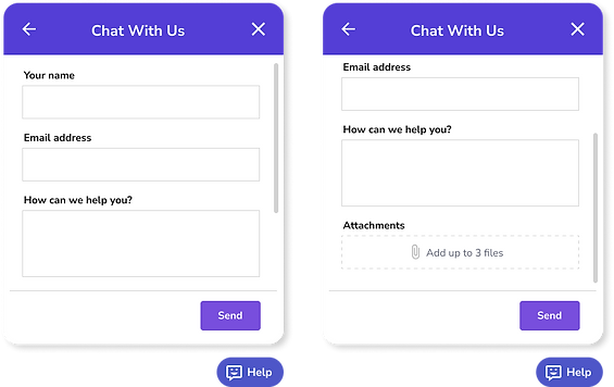
4. A new feature was created, where users can report an issue or feedback.
5. The Pro & Empire exclusive chat option was renamed to "Premium Area", showing appreciation for these users, without excluding regular ones from the conversation.

1
2
3
4
5
A
Improved solution for the Customer Support resources

Customer Support layouts
Outcomes
This was an exciting project to work with, as a part of its challenge was to think of solutions - while still respecting an existent ecosystem, procedures, and visual guidelines. I was very glad that the main outcome achieved was a scalable design solution, that will allow the platform to keep growing continuously.